Hello friendly friends!
Firstly, I want to start this post off by saying 1) I am NOT a graphic designer and 2) I like answering people's questions because I'm all nice like that.
One of my favorite bloggy friends - Christi Conley of Art Without Anxiety emailed me and asked me how I made my blog header. I figured if she had that question, maybe other people would, too! Thus, a tutorial was born!
I'm all about doing things for free and so everything I show you today is at no cost (unless you want to pay for a special graphic). Also, please note that everything that I'm showing you pertains to BLOGGER'S platform. I'm not sure how Wordpress would.
Step 1 - Identify the width of your blog
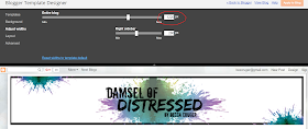
In order to make sure your blog header stretches all the way across your blog, you have to know how wide it is.
In order to figure this out:
> Go to blogger Dashboard
> Go to template
> Hit customize
> Hit adjust widths
> Find the number that is next to "Entire blog" and write it down
Step 2 - Go to Picmonkey
There are many free online graphic-making programs. I like to use Picmonkey because it's super easy and you don't even need a subscription or log-in information. Anonymity. Nice!
Canva.com is also a good online program, but it does require log-in information.
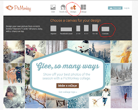
To start the process:
> Hover your mouse over "Design"
> Click custom
Remember that number you wrote down earlier, this is the part where you use it! Type that number into the right-hand box and choose a number, any number for the left-hand box. I'd suggest less than half the size of whatever the number is.
For this tutorial, my blog width is 1220 and the header I created for the tutorial is 550. My REAL blog header (at the top of the page) is 250 because I wanted it to be thinner.
Step 3 - Start Designing!
I'm going to show you several of the different tools on Picmonkey you can use.
Tool - Themes
For any beginner, this is the way to go. Each theme will have graphics, backgrounds, and font packages that work well together. So all of the guess work is taken out of it for you! I got this bird and a corner flourish from the Winterland Theme.
Tool - Add Text
Easy, peasy, rice and cheesy - Just figure out which text you want, click on it, then click add text. A font box will pop right up and you can just type right into it, then resize and reposition. The texts I used are "Edo" and "Special Elite".
Tool - Borders
You can play around with borders. Different shapes and colors are available. This one is the Drop Shadow border.
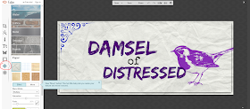
Tool - Textures
Textures... well I like to think of them more as backgrounds. There's metal, bricks, and - in this case - crumpled paper.
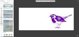
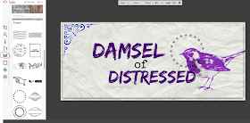
Tool - Overlay
Overlays are just graphics, really. There are many different free graphics to choose from. I really like the "Postal" themed graphics for vintagey stuff.
It should also be noted, that if you have a graphic of your own, or a picture that you've taken you can click on the Overlay Tool and then Click "Your Own" right up top and upload it.
Step 4 - Save it and Upload it
Once you're satisfied with your handiwork:
> Go back to Blogger Dashboard
> Click on Layout
> Click edit next to "header"
A pop-up box will... well... pop up. Click on "Image from your computer" then tap the "choose file". Upload your image, hit save, and VOILA! You're done.
That's it. Hope you all like my tutorial and if anyone has any questions, just let me know!
Also - if you ever have any tutorials you'd like me to write up, just let me know that, too!

