Sunday, September 28, 2014

"Watercoloring" with Spectrum Noir Markers

My Spectrum Noir markers definitely don't gather dust on the shelf.  I saw this amazing technique that creates a watercolored effect using stamps and markers and wanted to replicate the effects. I wish I could remember where so I could attribute it the technique! It creates a soft image without the harsher lines of a black outline.


To accomplish this technique, stamp your image in a color that's similar to the markers you'll be using. This particular stamp is from STAMPlorations's Bloom Sketches. The sketched flowers are already painterly, and it created a good complement for this particular technique. Since I was going with a golden yellow flower, I used Distress Ink Scattered Straw. I then colored a base with LY1 and shaded with GB4. After the shading was complete, I went back with GB 4 and made the outline darker and delineated the internal portions, too.

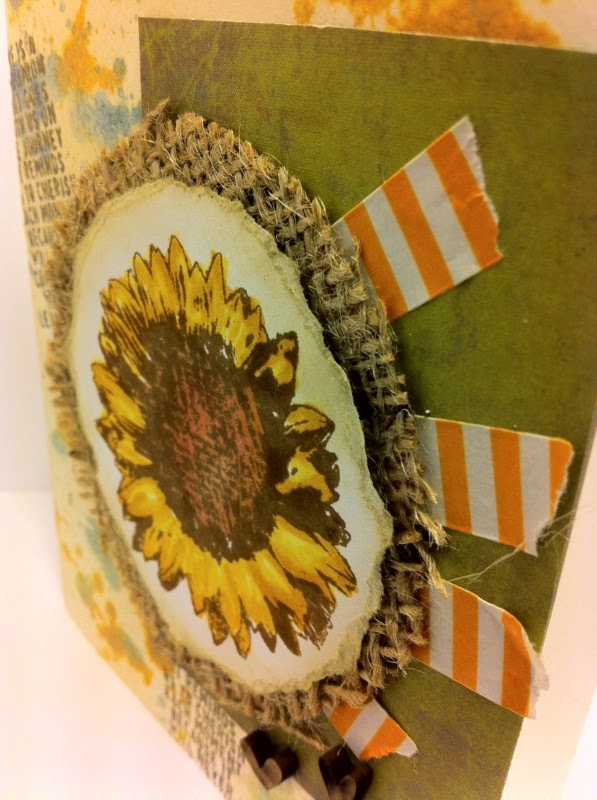
I have been having lots of fun experimenting with my new jar of embossing paste and created a textured background to go with the image. I used DI Scattered Straw, Wild Honey, and just a hint of Bundled Sage. I used a hexagonal stencil and smeared the corner with crackled embossing paste. I sprinkled Perfect Pearls in Perfect Gold and Perfect Pearl and really like how it turned out because it looks a little bit like pollen. Then I covered everything with white pearl embossing powder and dried it with a heat tool. 

I embossed the sentiment (which is also from the Bloom Sketches set) in gold and raised the image using mounting tape. Lastly, I added a couple of glitter sequins to give it a little dazzle.


 I'm going to enter this into the following challenges:


1. STAMPlorations "Anything Goes" challenge - If you have STAMPlorations stamps this is a GREAT way to earn some more for free. It's a never-ending challenge and they will give away free product every time 50 cards are entered. Don't have a STAMPlorations image? They currently have a free digi available so you can start playing!!

2. Simon Says Stamp Monday Challenge "Stamps and Stencils" 

3. Simon Says Stamp Wednesday Challenge "Anything Goes"

4. Crafting When We Can's Challenge "No Designer Paper"

When you leave comments, I LOVE to read through them! They make my day!

Friday, September 26, 2014

Paint Splatter Distress Ink Technique

Do you ever have one of those days where you walk into your crafting room, inhale the fumes of magic, and create the perfect card in like 10 minutes? Almost never for me, but apparently tonight was the night! 

I guess that's what you get from having some great inspiration. I stopped by the Fusion challenge this week and was immediately inspired to play along with this:


I decided to use both sketch and the image because I just received the most amazing sunflower stamp from STAMPlorations Blooms and Sketches set and haven't gotten the chance to show it off yet. Since they are having a new "Anything Goes" challenge that's a never-ending chance to win great prizes, I'm so happy that Fusion gave me a chance to ink it up. 

Distress splatter painting makes any card feel graphic and interesting, and I chose to incorporate that technique in my background. To achieve the technique, first create a base. I started by rubbing a paper with some Old Paper Distress Ink and embossed a saying from Tim Holtz's "The Journey" set. 


To get the splatter effect, squish some Distress Inks onto a craft mat and spray generously with water. I used Bundled Sage and Wild Honey.  Take a paintbrush and dip in the water and then flick the brush above the paper. (Make sure you're prepared to get some paint outside the edges!!) In order to achieve a really nice splatter effect, flick your brush from different angles and sides of the paper. 

My paintbrush apparently had some blue perfect pearls on it, and so a happy accident was formed. The tones from the blue mixed with some of the wild honey and just added another color to love.


To finish the card, I used some burlap I won from Simon Says Stamp's October blog hop. WOOHOO! I really like the effect. They also sent me some washi tape, which I'd never used before but now am in love with. I always thought it was kind of silly to tape up your card, but it just creates an amazing texture. 

I colored the flower with Spectrum Noir Markers and added some tiny little wooden hearts. 


All in all, I completely love the way this card turned out. I did a little happy dance and forced my boyfriend to ooh and aaah over it. :)

I'm also going to enter Simon Says Stamps Wednesday Challenge - Anything Goes.
 

All your comments are very much appreciated and loved!


Wednesday, September 24, 2014

Playing Around with Embossing Paste

The day has finally arrived! I have been seeing all of these gorgeous, textured cards made using embossing paste and was so jealous. I ordered a jar of my own and have been anxiously awaiting its arrival. After practically mauling the UPS man yesterday in my excitement, I dipped into my very first project.

I apparently ordered the "crackle" embossing paste by accident. Oh well! It it still created a really neat, albeit different, texture. 

Somebody told me that you should let it air dry for clean lines because the heat tool makes it bubble up. Naturally, I had to experiment so I made two cards!

When using an embossing paste, the first step is to find something to create the texture. I chose a polka dot stencil. Next, tape down the stencil very firmly to a crafting mat so no paste gets below the stencil. 


Next, begin to spread the paste over the stencil with a putty knife. Continue until the entire image is covered. 


Scrape off any excess and put it back in the jar before slowly peeling off the tape and lifting the stencil. 

You can choose to air dry, or you can choose to heat dry. I let the red card air dry and it did create a much cleaner outline of the stencil. It also cracked more, which is how this particular paste should work. On the blue and yellow card, I immediately sprinkled some clear glitter embossing powder over the paste, then dried with my heat tool. It didn't crack at all but did bubble up and create and amazing texture. I prefer the heat dry effect, but will have to try both with other stencils, too.


 The Retro Sketches site is my new all-time favorite sketch site. I'm going to enter my red card into their weekly sketch challenge

The red background just screamed Christmas to me, so I incorporated it into a holiday card using Stampin Up's Bells and Boughs set to create a colored poinsettia and added a little sparkly embossing powder to the holiday sentiment. I decided to play along in Merry Monday's Christmas Bingo challenge this week, too! 

Here's the finished Christmas card:


Other challenges I'm submitting to:
Simon Says Stamp's Monday Challenge "Stencils and Stamps"
A Blog Named Hero's Challenge "Papers Please"

I decided to use the second card to make a card for my Aunt Jana. Last year her little boy was diagnosed with a rare form of cancer that affects children. He was such a strong boy and fought and won the battle. At his last check-up, however, they found some build up in his lungs, which is often the first sign to relapse. Doctors don't seem too concerned at this point, but are beginning to monitor him more closely. If you all could keep him and his family in your thoughts and prayers, I would really appreciate it. 

I added a tag to the card and used STAMPlorations amazing "Bloom Sketches" set. STAMPlorations is having a new kind of contest that I'm really excited about. They have now have a never-ending challenge for anyone who uses their stamps. For every 50 cards that are uploaded to their gallery, they are giving away free product! Woohoo! I better get the ball rolling! 


I painted over the daisy with Perfect Pearls "perfect white" for a little shimmer and embossed the "Be Well" sentiment in gold. Overall, I think it complements the background perfectly!


Challenges I'm submitting this card to:
Simon Says Stamps Wednesday Challenge "Tag It"
Pile It On's Challenge: "Shiny"
Simon Says Stamp's Monday Challenge "Stencils and Stamps"

Thanks for staying with me on this unusually long post! Your comments are much appreciated!

Sunday, September 21, 2014

Perfect Pearls Technique with Fall Color

Trying to use sketches is one of the MOST challenging things for me, for some reason, but I keep trying to push myself to do it and came across this great sketch challenge over at The Sweet Sunday Sketch: 


As you can probably tell by some of my past cards, one of my favorite products to use are Perfect Pearls. They pair so well with a vintage/distressed aesthetic because they can add a little shimmer without making things look too "perfect". The Heart 2 Heart challenge this week was to show off your favorite technique, so I grabbed my Perfect Pearls and created this amazingly gorgeous fall background:


If you really want Perfect Pearls to pop of the page (there's some alliteration for you), try them out on black cardstock. First, ink your stamps with Perfect Medium, which will allow the Pearls to adhere to the page. I used Close 2 My Heart's Summer's Wave leaves to create my background. 

Next, choose which colors you'd like to use and brush the product onto the stamped image with a small brush. I used Forever Red, Perfect Copper, and Perfect Gold to create an autumnal feel. 


After you are satisfied with your coverage, use a larger brush to get off all the excess powder. 


As you brush, your image will continue to become more defined. Lastly, be sure to spritz with water using a mini mister to set the image permanently into place.

To finish the card, I cut 1/2 inch strips of black paper, blotted perfect medium onto them, and then covered with more Perfect Pearls. It created this cool, almost metal-like effect. 

The sentiment was embossed in gold.  Both the sentiment and the vines around the edges are from Close 2 My Heart's Harvest Memories set. 


All in all, I think this technique is a great way to incorporate fall color in an unexpected way. I'm also going to enter this card into Penny Black's Autumn Colors challenge and the Pile It On Shiny challenge

Friday, September 19, 2014

Pretty in Pink - Watercolor Painting with Distress Inks

Happy Friday! I'm finally beginning to bounce back from a week that has been a one-woman-homage to Kleenex. Stupid colds! I was running out of time to complete STAMPlorations's latest sketch challenge. I find sketch challenges to be the trickiest, especially if they don't involve a place for large images - which are my go-to. So when I saw the sketch, I was hesitant to take it on.


I pulled out STAMPlorations's Bloom Sketches set and began to play around with the daisy and some Distress Ink handpainting.


  • Step 1: Emboss your image. I used a sparkly clear embossing powder.
  • Step 2: Swipe Distress Inks on a craft mat and spritz with water. I started with Worn Lipstick and layered with Victorian Velvet. I did the centers with Mustard Seed.
  • Step 3: Paint your image and layer with different colors. 
I was going to top my creation using some patterned paper, but wound up loving it so much that I wanted to show it off. Instead, I used some pink vellum and cut out the sketch parts using an Xacto knife. Haha! I solved my problem by using the reverse of the sketch!


All in all, the vellum added a delightful softness and the bright bursts peeking through the cutouts was a great counterpoint. I added some sheer ribbon to keep the card's delicate feel and finished it with a cheerful saying from the same STAMPlorations set.


Since I was able to try a new technique, I'm going to enter this into Simon Says Stamp's Monday Challenge Blog - Rock the Technique. I also incorporated vellum into my challenge, which makes a great card for The Friday Mashup challenge!

Thursday, September 18, 2014

Spooky Stamps and Markers

I've talked before about the international card exchange I joined at the Society of Stampaholics. The time has come to mail out cards for my second month of participation and the challenge could incorporate themes of either friendship, Halloween, or the moon. 

I got a real bargain on some holiday stamps at an estate sale and haven't had the opportunity to use them yet. So I busted out this adorable little witch and got to work coloring her up with my Spectrum Noir markers.
 Half-way through coloring, I stopped and thought, "Huh... do they celebrate Halloween in New Zealand?" Turns out, NOPE! New Zealanders don't trick-or-treat from what Google tells me. Shoot! But at least I get to share this cute card with you immediately, rather than waiting until Dawn in New Zealand gets it. She'll get a different creation. 

This cute card will just have to be mailed to somebody else...maybe with a bag of candy corn!


I also got a lovely comment from Darnell Knauss who just started a new challenge called never-before-used-schtuff. Just from reading her blog, I can tell she has an amazing wit and just loves to encourage other crafters, so I will happily be entering this into her second NBUS challenge


I also will be entering it into Crafting for All Season's Challenge "Colors of Autumn" and STAMPlorations "Stamps and Markers" challenge. 

Friday, September 12, 2014

Birthday Blooms with Distress

It's amazing to me, now that I've started creating again, just how many reasons I can find to pull out my ink and stamps. I can hardly keep up with all the things that could use a lovely handstamped card!

Tomorrow, my aunt Julie turns...erm... well ladies never tell, right? I won't spill her secret, but I will show off the beautiful (if I do say so myself) card I created to pop in the mailbox tomorrow. 

In searching for challenge blogs, I came across STAMPlorations stamps and immediately fell in love. The beautifully sketched stamps jive so well with my aesthetic, so I joined their stamp club and now will get amazing stamps mailed to me every other month. Just a lil' sumpin' sumpin' to anticipate and keep me inspired.


I received my first set two days ago and have been eagerly anticipating getting to put it to use. I felt delighted when I opened the package and received a handstamped, handwritten card (shared above) from the owner of the company. What an amazing touch!

I unwrapped it and immediately began creating. I wanted something cheerful, which can be hard to accomplish with distress inks, but I think I pulled it off.

First, I created a background using Mustard Seed Distress Ink and one of the daises from the "Bloom Sketches" set. Next, I created a 2-inch panel and cut out a 3-inch half circle in the middle to make room for my daisy. I used Old Paper Distress Ink and a sponge to give it a worn look and embossed over it with gold. Then I squished some ink onto my craft mat, spritzed lightly with water and dabbed until I got the effect I wanted


Next, I embossed the gorgeous daisy with the same gold and fussy cut and glued some of the petals to create a layered effect. I colored the center using Spectrum Noir markers and used mounting tape to lift it. 


Lastly, I added the saying and called it a night! I think it will brighten my aunt's day. 


Since I created my own background, I'm adding it to the Simon Says Stamp Wednesday Challenge "Make your own Background".


I'm also entering it into STAMPlorations's current challenge: "Stamps and Markers". I love the challenges on both of these sites because you don't have to use their stamps to play along. (Perfect for my limited budget!)

Wednesday, September 10, 2014

Stamping Heritage - A Family Card Exchange

When I was younger, I would sit across the table in my grandma's kitchen. I'd happily color stamped cards with markers and splatter glitter everywhere while my grandma smiled encouragingly. She always encouraged my crafting - no matter how much of a mess I made. And she always praised my latest creation - no matter how much it deserved it or not. 

I love my family's strong crafting heritage and the encouragement I got from all of my aunts and my grandmother to keep cutting, taping, and inking things up. It's part of what turned me into the crafter I am today. That's why I'm happy to be able to display my family's latest initiative - A mailed card exchange. 

We used to throw "card parties" and we'd each make a set number of cards based on the number of participants and then exchange so we would wind up with all different cards. It was so much fun! But, alas, things have changed and we are now spread in six different states! To keep things going, we've decided to move our card parties to the post office.

It was so amazing to receive the packages of cards, organize them all, and mail them out to their next destinations. It was like Christmas the week the cards were supposed to arrive, and I'm sure my postman wondered what I was up to! All in all we created and exchanged 182 cards! I'd say that's pretty impressive

Without further ado, here are the lovely creations of my family:


This is the card I created for the exchange, and am entering into The Color Throwdown Challenge #309. I love how cheery it turned out. I colored the hippo from the "Pun Fun" stamp set using my Spectrum Noir markers. 


If you have some crafty family members, consider starting and exchange of your own! It's a great way to encourage crafters to hone their skills. (And the cache of cards you'll build up is its own reward!)

Tuesday, September 9, 2014

Patterned Playfulness and Holiday Cheer

Well, it's that magical time of the year again... The time when Christmas is actually still 3 months away but retail shops have gone into overdrive. They've already tossed out the turkey and put out all things red and green. Oh well - I might as well hop on the bandwagon, right?

Patterned paper can be a doozy to work with, but I've been loving all the graphic fanburst cards with the strips of patterned paper stemming out from one corner. I decided to do an interpretation of the fanburst cards and do pieces of paper in a slightly different pattern. Do not try this at home, folks. It takes forever! Just kidding. I hope you do try it at home and then tell me your secrets! At least it's worthy of an entry into Virginia's View Challenge #7 - Patterned Paper.  I think the background turned into a statement piece.


The best bet to get all the pieces to fit together without pulling your hair out (if you're not a math genius and know how to do the proper angles) is to start with the top and work your way to the bottom. 

I also wanted to play in A Blog Named Hero's "Spell it Out for Me" challenge so decided to bust out the dusty stamped letter set I own and create some faux Christmas ornaments that spelled out a jolly saying. I didn't want to cover up the background effect, so I intentionally kept the card cleaner than my normal aesthetic. 


I cut out some 1-inch balloons using Cricut's Basic Shapes Cartridge and turned them upside down. Next, I embossed the letters in white and added a glossy layer to the top to give them that ornament feel. A little white ribbon finished the look. Note to all those who want to attempt this look: do not try to speed up the drying process by using your heat tool gun or you will have to start all over. The glossy accent material does not like to be trifled with. Just do yourself a favor and let it sit overnight. 

I used Stampin Up's "Bells and Boughs" set to ink a piece of holly using Distress Ink "Forest Moss" and colored it with Spectrum Noir markers. I added some dots of the glossy accent to raise the berries.


The finished project is both merry and bright and will make a perfect card for the upcoming holiday season. Even if it did take forever and a lightyear to figure out. :)

MATERIALS:
Red and green cardstock
Patterned paper (I think stripes give it an even cooler effect)
Inkssentials Glossy Accents
Cricut "Basic Shapes" cartridge
White ribbon
Distress Ink: Forest Moss
Spectrum Noir Markers: LG4, DR4, DR6, GB11
Stampin' Up "Bells and Boughs" stamp set